UX design process for a mechanical service
SJVC Mecanics was a website that offer a fast automovilistic diagnostic approximate inserting a few or nothing of car's information
My role
I was the UX researcher and UX designer, i did so many emphatizations and definitions, all the designs and prototypes in diferent size screens
Project Goal
Desing a service, a fast and approximate way to get a automovilistic diagnostic to they without knowledge about the theme
Emphatysing
Users pain points
Experience
There is not a website of automovilistic diagnostic yet that have the functionality of answar questions to get a posible cause or reason
Updating
The most of car websites tend to be old or they use obsolet technologies and designs that aren't supported by all browsers and devices
Time
In the finding of solutions on the web you'll see a variety of information sources and sites, is slow to the users read and process all that information
Language
The automobile websites seems diricted to mechanics instead of designed to the car's owner that unknown so many typical terms

Principal constraints
- Real world diagnostic are so expensive
- Need to hace an intermediate (some times advanced) knowledge of their automobile and it's components
Desing strategy
Site map

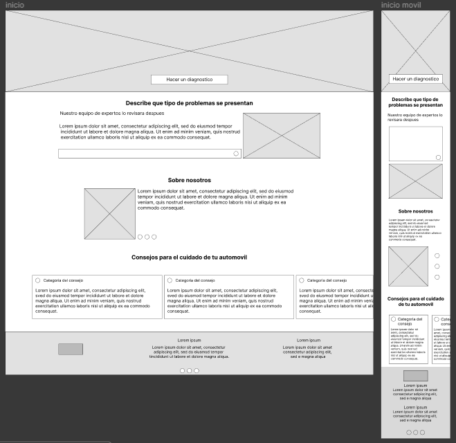
I begin to create distinct versions of each principal page, to get practice i try to use desktop-first filosophy
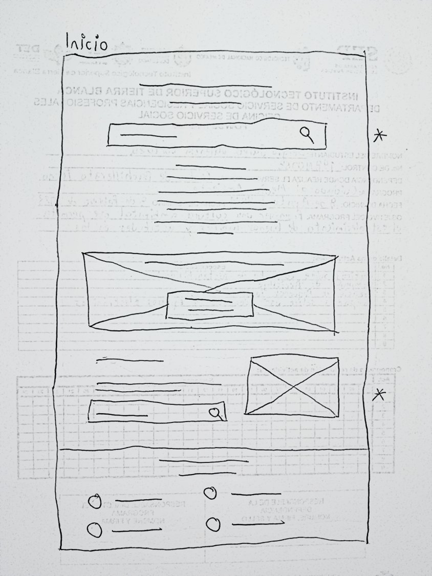
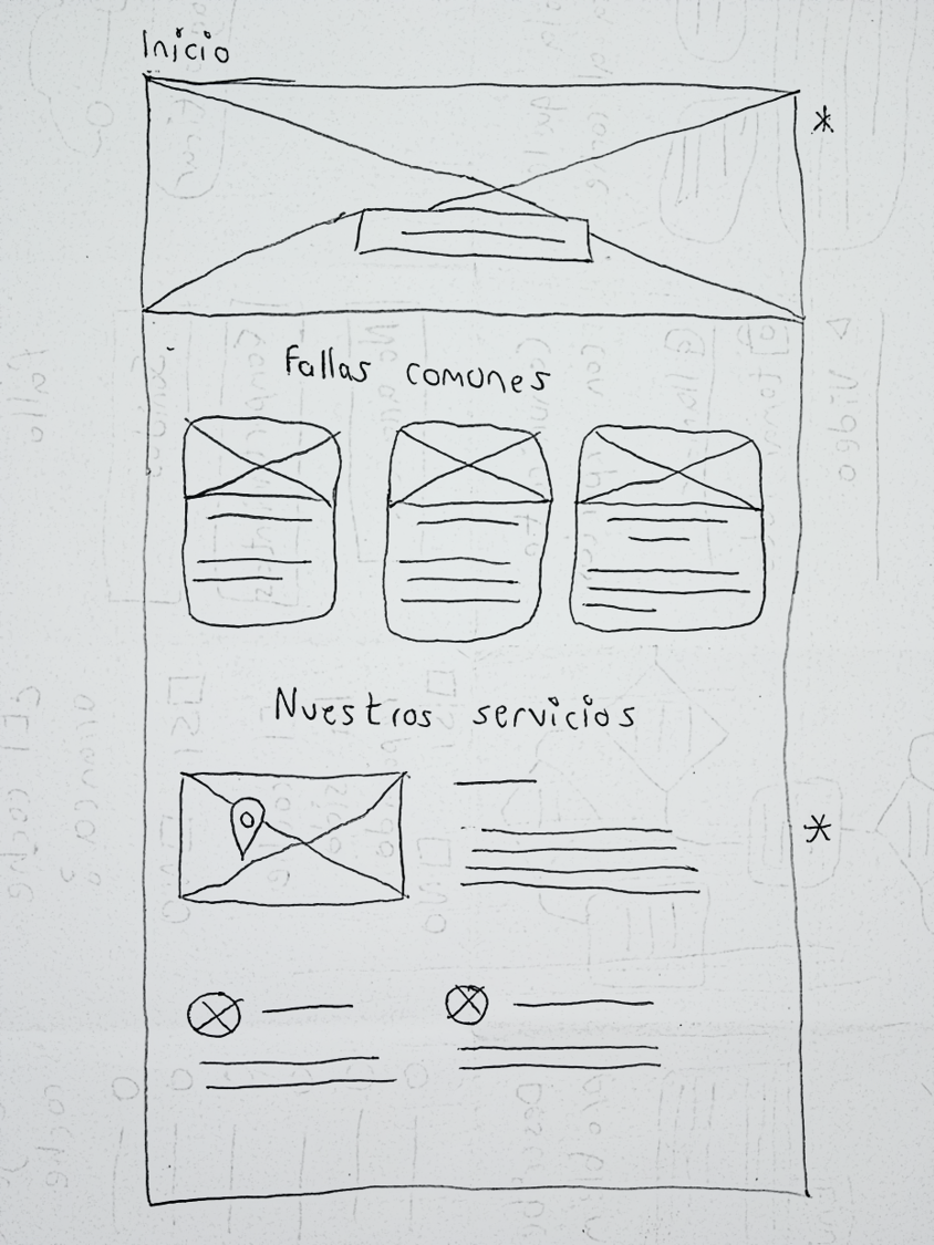
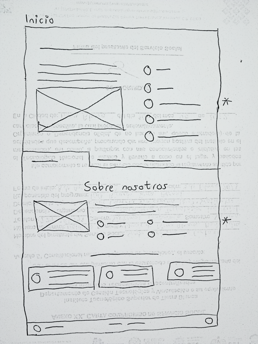
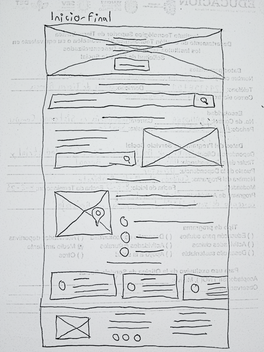
Digital wireframes
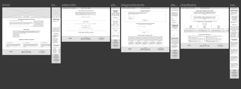
Prototyping
First prototypeTest in users
Planning the study
To advance from one design to another better inside the same project i like to plan a usability study to know what see other than me no.
Study goal
Firstly about what need the user, what is better for all if there is not something necesary
Interview script
it's made up of an introduction, ice breaking, task with distict alternatives and final conclusions / questions.
Here is the place to a big specification to practice the tasks and questions that i will do.
Results
Research insights
Selecting auto
Users needs a better explanatiuon to next steps
Questions
Users needs to insert data in a more intuitively way
Buttons
Users needs to read a accesible language and easy to understand
Final prototype
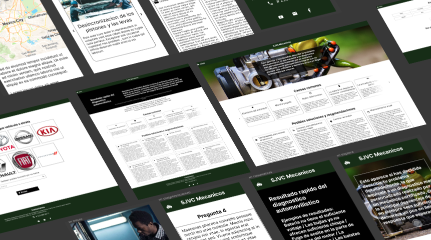 See final prototype
Next steps
- Make user accounts to can continuing with a chat to they that describes their specific problem with our experts
- Finish the desings to the mobile responsive version
- Get an agree with the mechanic team to start make all possible questions and diagnostic results.
What i learned
Put coordinates and distances in a more suitable between the elements. Make interactiver prototypes. I now can take advantge of the assets panel